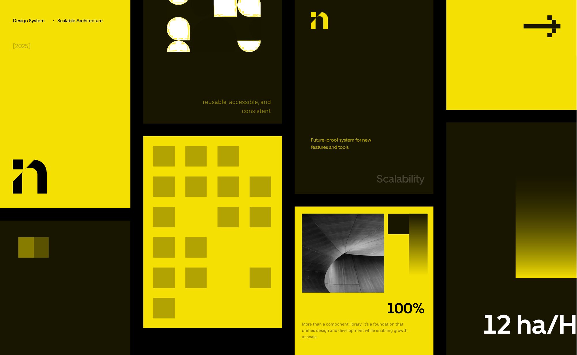
More than a component library
Insights CoPilot is an AI assistant for ABI. As it grew, its interface needed a shared backbone. The design system is that backbone: a foundation that unifies design and development while enabling growth at scale.
Why did we start building it?
As CoPilot grew in adoption, the product began to face the weight of scale. Small inconsistencies in design and interaction patterns started to multiply, creating friction for both users and teams.
Inconsistent UI
Buttons, chatbars, and labels appeared differently across versions.
Fragmented UX
Users struggled with trust due to mismatched visuals and flows.
Scalability risks
Every new feature risked adding more inconsistency without a shared system.
Slowed delivery
Lack of standard components led to rework and longer handoffs.
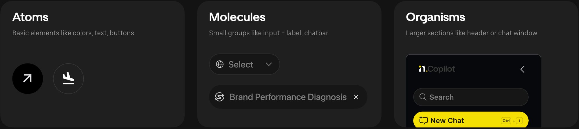
Built on atomic design principles
The goal was not only to unify the look and feel but to create a system that designers and developers could both trust and scale with. By breaking the interface into clear building blocks, we established a foundation that was reusable, accessible, and consistent across every interaction in CoPilot.

The Design DNA
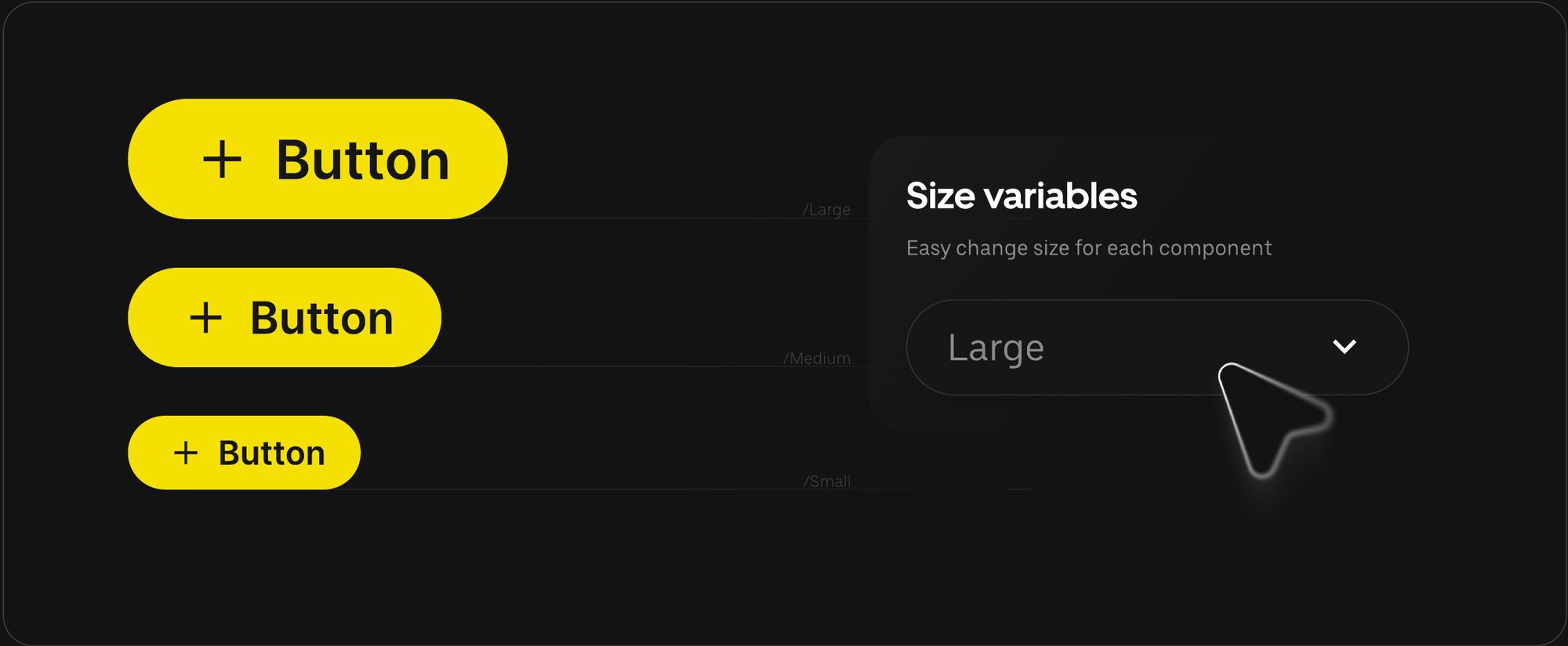
Smart foundations built to balance simplicity with depth. Effortless to use, robust enough to grow with the system. Colors, sizes, and fonts live in variables, so a single change flows through every component that uses it.
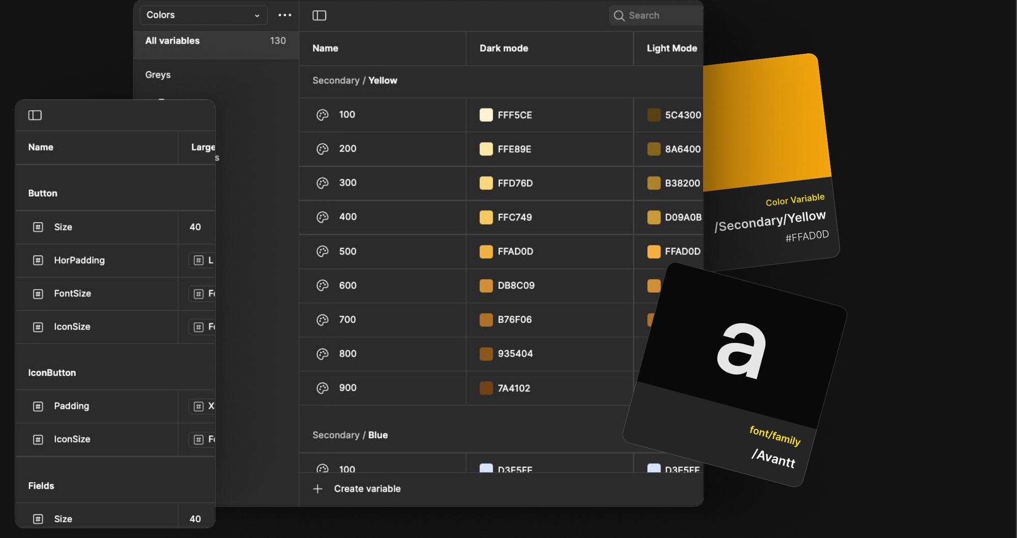
A core setup that stays intuitive for designers yet adaptable for complex scenarios.
Smart components
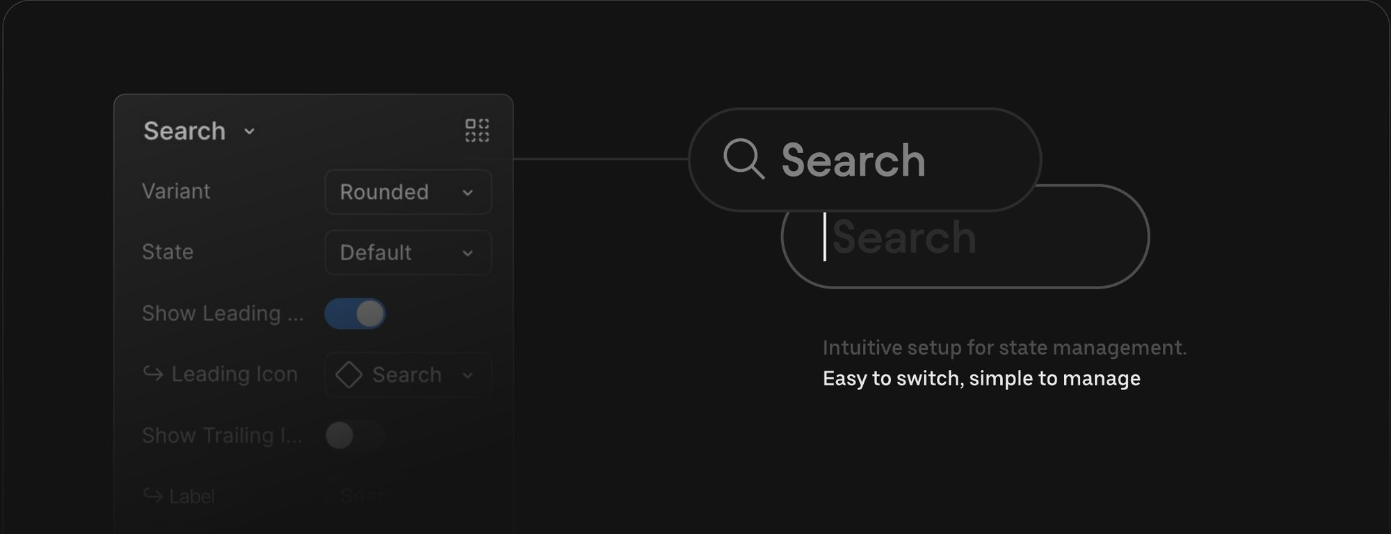
All components were built with customizable properties, making them easy to adapt, manage, and scale without creating clutter. Simple to tweak, powerful to use, and consistent across every screen.
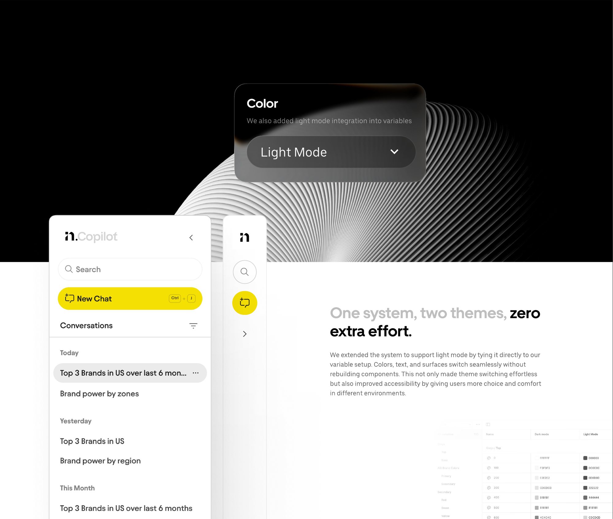
One system, two themes, zero extra effort
We extended the system to support light mode by tying it directly to our variable setup. Colors, text, and surfaces switch seamlessly without rebuilding components. This not only made theme switching effortless but also improved accessibility by giving users more choice and comfort in different environments.
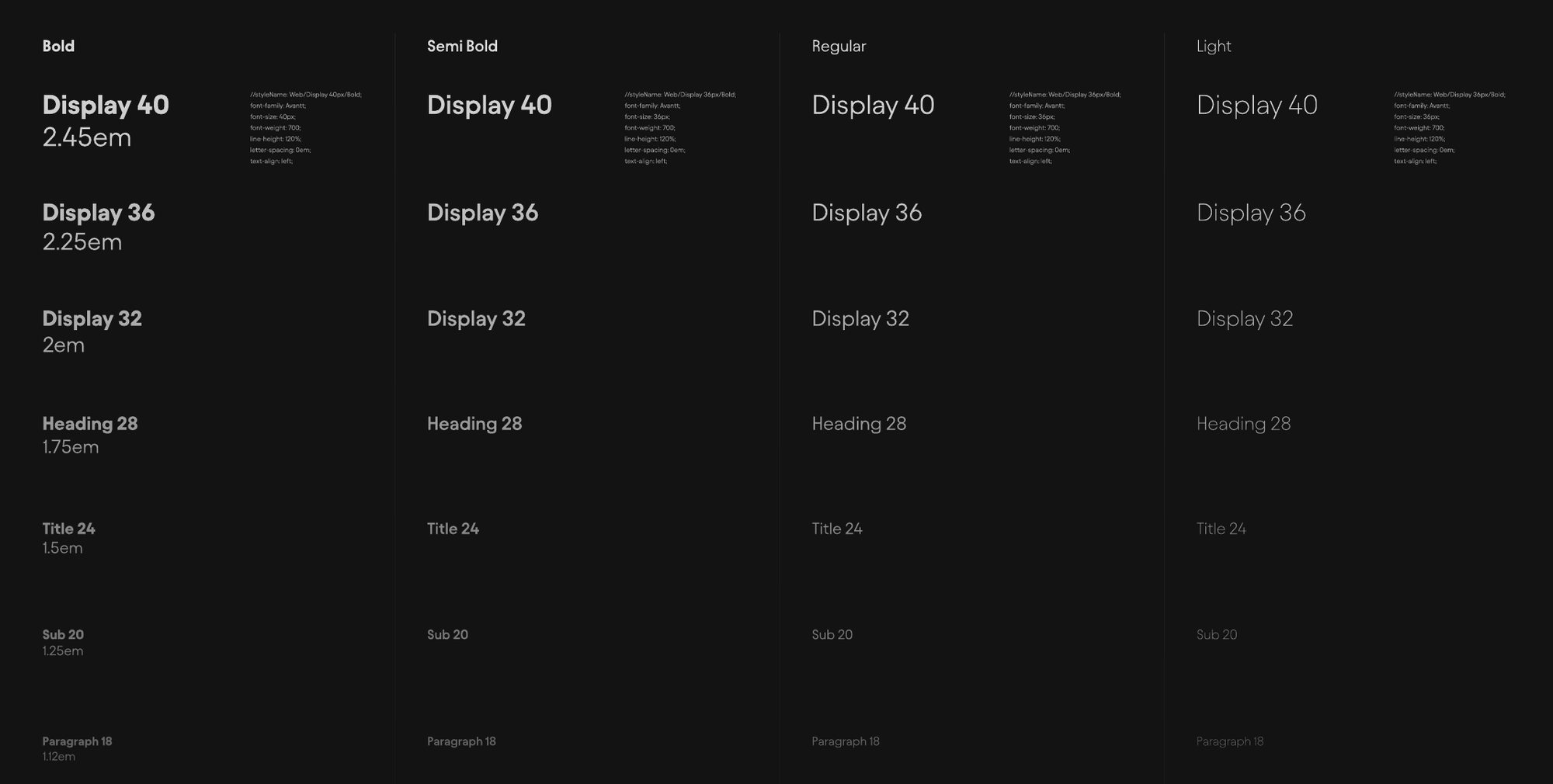
Type scaled for clarity and consistency
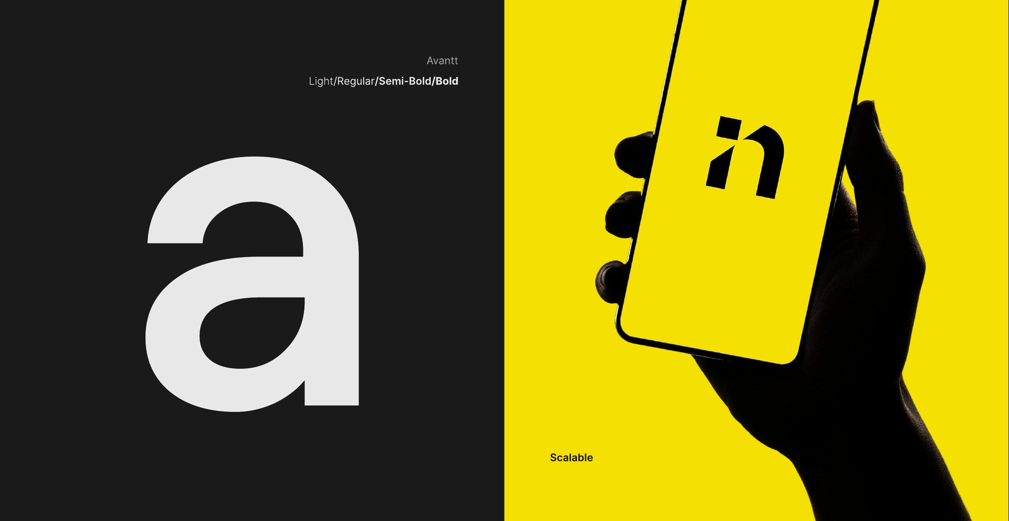
We defined a type system that balances clarity with hierarchy. Scales, weights, and styles were set to make content easy to read, consistent across screens, and adaptable for both light and dark modes. This ensured communication in CoPilot feels professional, accessible, and effortless to follow.
Numbers that tell the story
The design system became more than a library of components. It served as the backbone for how CoPilot scaled.
What's next: CoPilot on mobile
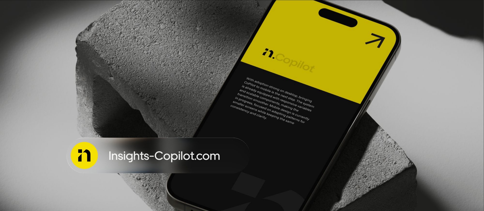
With adoption strong on desktop, bringing CoPilot to mobile is the next step. The system is already equipped with responsive variables and scalable components, making the transition smoother. Mobile design is currently in progress, focused on adapting patterns for smaller screens while keeping the same consistency and clarity.
Meet the team
Behind the visuals and brand assets of Insights CoPilot is a small but focused team that shaped the system from idea to impact.